Economic Inequality In America, Explained In Graphs

Liberal-leaning think tank, the Center for American Progress, recently launched the Washington Center for Equitable Growth (WCEG), which is an organization that will research and analyze structural changes within the United States economy and to see how they affect economic growth.
In a conference held last week to announced the launch of the WCEG, top economic researchers presented graphs that pointed to some possible causes underlying American inequality. They hope that these statistics may help policymakers form solutions to America's ever-increasing issue of economic inequality.
Top economic researchers and academic experts discussed research on temporal and geographic patterns, focusing on issues including current pre-tax inequality among different countries and pre-tax income share throughout U.S. history.
While some focused on American income distribution, a group of four economics professors from Harvard and UC Berkeley researched social mobility as it pertains to economic inequality.
Essentially, social mobility is how much a person's income will rise or differ as they grow up. For example, if a kid is born poor (low income), but grows up to be rich (high income), the kid is a statistic of high social mobility. So, high social mobility means larger jumps up the income distribution, and low social mobility meaning the opposite.
READ MORE: L.A. Homeless Community Plagued By Income Disparities
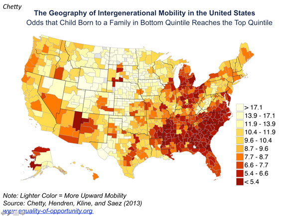
These four professors researched the probabilities of social mobility, and also broke down the probabilities geographically. Here are their results.
They discovered that social mobility appears lowest in the South and the industrial Midwest. High numbers of African-Americans and the persistence of residential segregation have led people to believe that these statistics illustrate a "caste-like system," that allows the wealthy to remain wealthy, while the poor continue struggling with their own economic disadvantages.
If you want to find out how cities near you compare, click here for the New York Times' interactive version of this map.

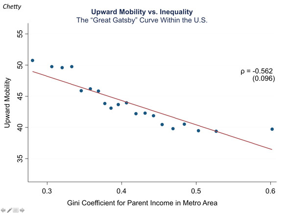
So, if a poor kid is living in Mississippi and the neighborhoods in Mississippi are incredibly segregated along class lines, that kid is more likely to stay poor, or at least middle class for the rest of his life, as illustrated in the graph to the left.
Now, of course, this is speaking in general terms. If he has big aspirations and incredible drive to become a famous movie star, he could surely ascend through the class ranks. But the negative curve in the above graph wasn't dubbed "The Gatsby Curve" for no reason.
In short, a large sum of money has been donated to research the reasons behind economic inequality in the United States. And from this research, we've essentially learned that 1) economic inequality exists in the U.S. and 2) the American Dream may remain merely a dream to most Americans.
For more charts and statistics from the conference, click here.
Reach Contributor Katie Chen here. Follow her on Twitter here.


